As part of a UX design course, I worked on a semester-long project for a fictional nonprofit client, People Helping People (PHP).
The goal was to create a website that connects community volunteers with individuals needing assistance, such as the elderly or those with disabilities.
UX Designer on a team of 2 others
Involved in end-to-end design: from research and ideation to wireframes, prototyping, and mobile adaptation
Design brief
The existing system relied on manual communication — calls and Excel spreadsheets — which slowed down the matchmaking process and left many users without support.
- PHP needed a website that was:
- Accessible for users with varying abilities and tech skills
- Easy to use for both volunteers and those seeking help
- Visually simple and trustworthy
- Flexible and scalable for future community growth
Hypothesis
Our team developed hypotheses based on user pain points and business priorities. The most critical one centered on accessibility:
If we implement high-contrast settings and large buttons, users with limited tech skills and possible visual impairments will find the website easier to use, resulting in reduced eye strain, increased readability, and fewer accidental inputs.
- Supporting features we prioritized included:
- High-Contrast for improved visibility
- Large Buttons to minimize errors and aid navigation
- Mobile Compatibility to support access across devices
Personas
- We developed three primary personas:
- John: a tradesman volunteer with limited time and basic tech skills
- Jordan: a 32-year-old with cerebral palsy, moderate tech user with accessibility needs
- Billy: an elderly widower with limited internet experience and vision challenges
Ideation & Wireframing
Using Figma, I translated our hypotheses and user journeys into low- and mid-fidelity wireframes.
- Early concepts included:
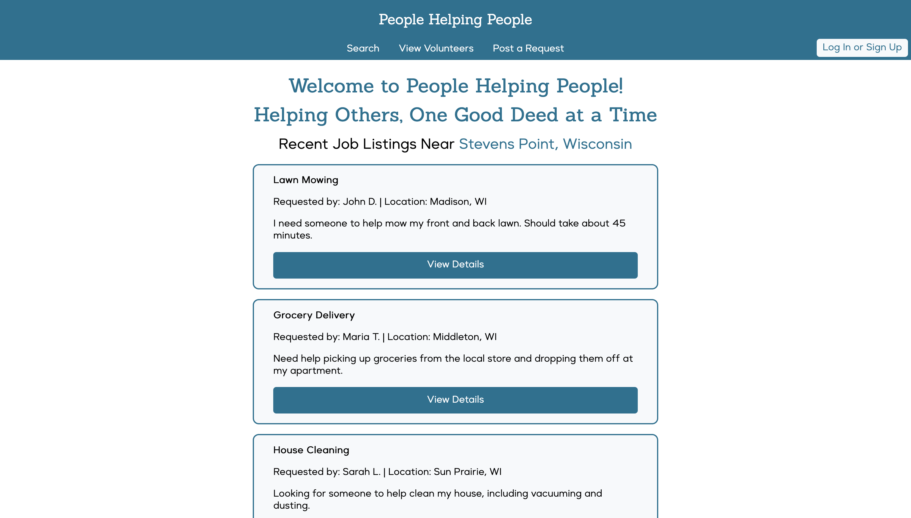
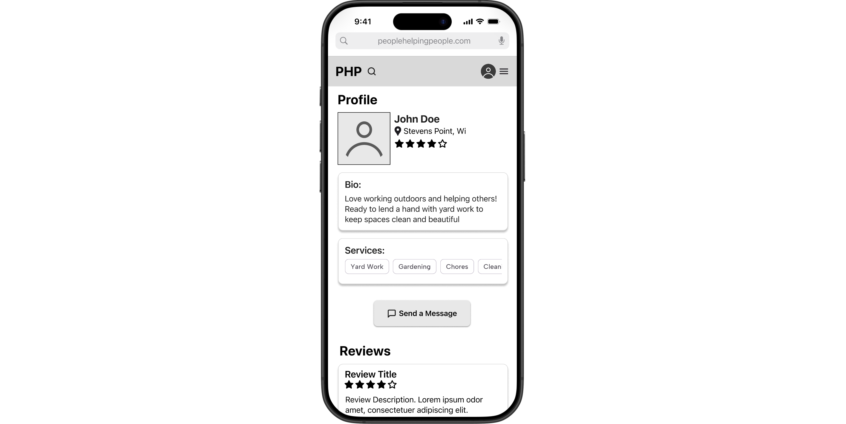
- Profile Pages that clearly divided sections using whitespace and labeled groupings (About, Services, Contact Info)
- Edit Profile Forms that supported both seekers and volunteers, allowing toggling roles
- Search Pages using a grid layout and chunking patterns to organize jobs by category, urgency, and proximity
Visual Design Exploration
Once functionality was mapped out, I moved into applying a cohesive visual system.
Using color theory principles, I designed a palette that met WCAG accessibility contrast standards, while projecting trust and friendliness.
I paired a clean sans-serif typeface for headers with a slightly more readable serif option for body content, ensuring legibility without sacrificing modern aesthetics.
Responsive & Mobile Design
Understanding that many users—especially volunteers on the go—would access the platform via phone, I adapted the layout for mobile screens.
- This required prioritizing core functionality on small screens, such as:
- Collapsing menus into hamburger navigation
- Stacking content cards vertically with intuitive swipe behavior
- Reformatting profile sections to reduce visual clutter without losing hierarchy
Design System
We began by exploring existing industry-standard design systems—Google's Material Design, Apple's Human Interface Guidelines, and IBM's Design Language—to understand what makes a system clear, consistent, and extensible.
This research shaped how we defined our own UI components, visual identity, and documentation structure.
- With our visual identity clarified, we created our core UI styles in Figma. These foundational elements included:
- A color palette with primary, secondary, and neutral tones
- An icon library (Material Icons) supporting accessibility
- Typography for headings and body text, using careful spacing and font weight to establish hierarchy
- Reusable desktop-focused components components like cards, buttons, and form fields, with plans to expand for mobile and tablet responsiveness later
- Documentation on usage and interaction guidelines
Our documentation also included code snippets, ensuring the front-end implementation stayed consistent with the design specs.
We paid special attention to naming conventions, variant states, and spacing rules, knowing these would be reused throughout the prototype and by future developers
Interactive Web Prototype
After multiple design iterations, user-centered research, and extensive prototyping, our team delivered a responsive, interactive website prototype for People Helping People (PHP). The final product combined all of our individual design explorations into a seamless user experience that supported both volunteers and community members needing help—particularly elderly and disabled users.
- The final site enables users to:
- Register or log in as a volunteer, someone seeking help, or both
- Search and filter job listings by location, service type, or availability
- Post a new job request
- Send and receive contact requests, with feedback animations and status indicators
Some early ideas, like a recomendation system or a built-in live chat, were scoped out due to accessibility and feasibility concerns. We prioritized clarity and simplicity over feature overload.